

02 / 04
Voltora Elektronik
An e-commerce interface for electronic components, built with React, TypeScript and Tailwind CSS. It covers product discovery, filtering, wishlist, cart and account screens as a comprehensive frontend system running on mock data.
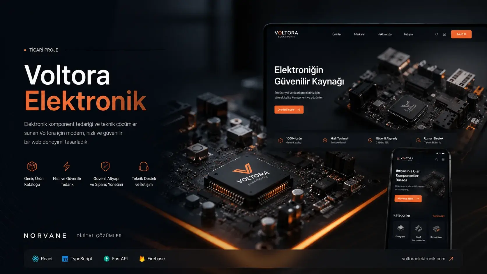
Project snapshot
- Status
- Completed
- Role
- Frontend development, user experience, design system, and interaction design
- Technologies
- React · TypeScript · Tailwind CSS · Vite
Overview
Turning technical products into an approachable shopping experience.
- Context
- A frontend e-commerce experience for electronic components and embedded systems products, bringing technical product information, discovery, and shopping interfaces together under one design system.
- Goal
- To establish the product model, filtering system, and shopping states as a working end-to-end interface before a backend is connected.
- Norvane’s role
- Frontend development, user experience, design system, and interaction design
The Need
People shopping for electronic components need more than an image and a price: category, specifications, availability, and compatibility all shape the decision.
The central design challenge in Voltora was to present that technical density without turning the interface into a catalogue maze, and to keep it easy to scan for makers, students, and embedded developers.
- Technical information densityPresenting title, description, specifications, availability, price, and category in one balanced hierarchy.
- Catalogue breadthEnabling fast discovery across development boards, sensors, power modules, robotics parts, and cables.
- Mixed user intentSupporting both the visitor hunting a specific part and the one who does not yet know where their project starts.
- A connected shopping flowConnecting discovery, wishlist, cart, and account screens through one consistent component language.
Approach
Voltora’s visual system is built on black navigation surfaces, light content areas, and controlled mint accents. Mint is used for primary actions, focus, borders, and active states rather than as a dominant surface.
This keeps the electronic-laboratory character without letting the interface drift into a neon or gaming aesthetic. Product cards, filters, drawers, modal surfaces, and inputs all follow one shared component language.
Two-state navigation
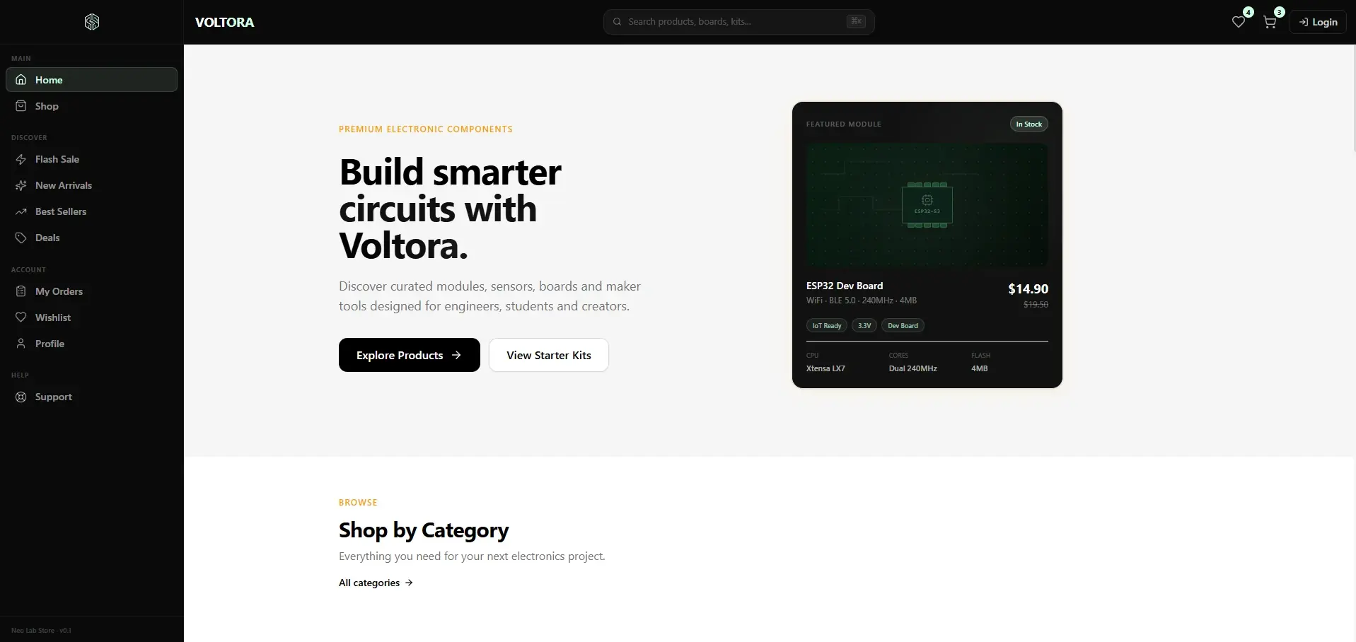
The sidebar runs collapsed or expanded so category access stays available without costing content width. The home screenshot shows it expanded; the listing screenshot shows it collapsed.
Abstract product visuals
Category-derived abstract card visuals stand in for product photography, giving a consistent technical storefront without sourcing photos.
State-first components
Product states — in stock, low stock, out of stock, discounted, bestseller, new — are designed into the card system rather than bolted on.
Layout layer
- App / Router
- Sidebar
- Topbar and search
- Content area
- Footer
Commerce layer
- Product card
- Listing and filters
- Wishlist
- Cart
- Order summary
Foundation layer
- TypeScript type models
- Mock data modules
- Hooks
- UI components
Design tokens
- Black#000000
- Mint#CFFFE2
- Soft mint#A2D5C6
- Dark surface#111111
- Light background#F6F6F6
Features
Bringing search, filters, and view controls into one discovery system.
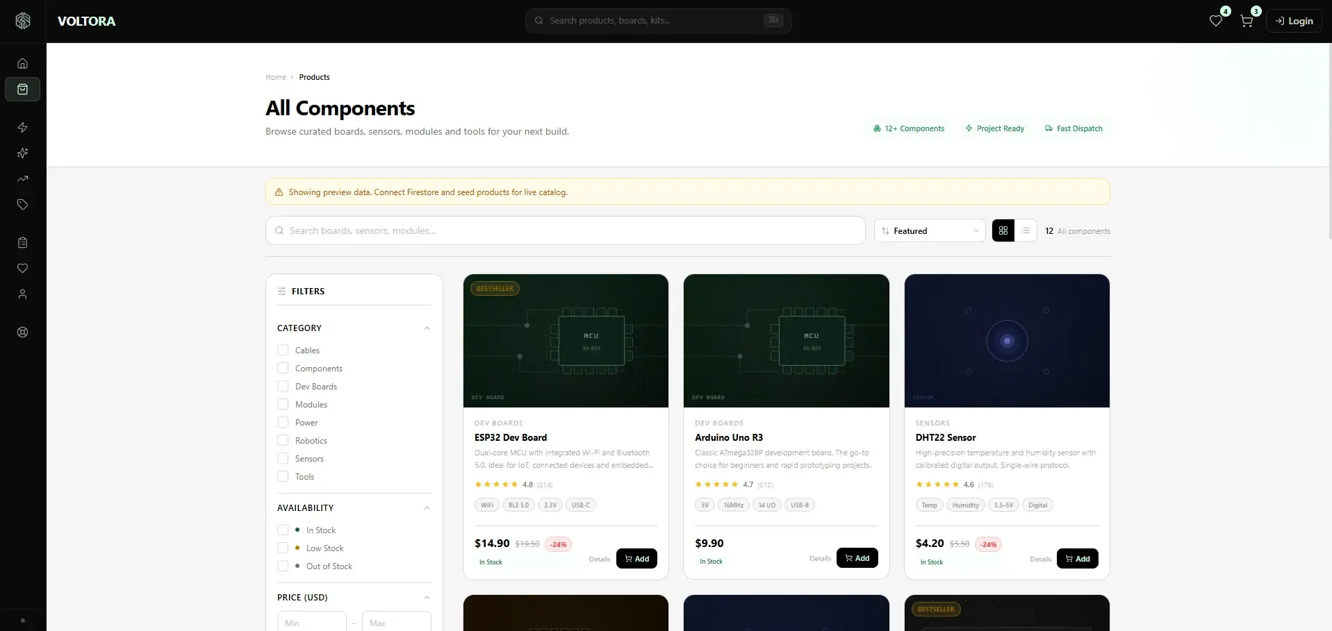
The listing experience lets people narrow components through search, filtering, and sorting. Category, availability, and price-range filters are handled through one filtering model, while grid and list views suit different preferences for information density.
The banner at the top of the screen is the application stating, in its own interface, that the catalogue currently runs on preview data and needs a Firestore connection for a live catalogue.
- Product search
- Category filter
- Availability filter
- Price range
- Sorting
- Grid and list views
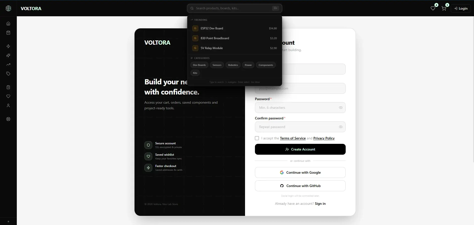
Moving search into a keyboard-reachable command surface.
The search field opens as a command palette: trending products are listed with their prices, categories appear as shortcuts, and the panel spells out its arrow-key, Enter, and Esc behaviour along the bottom.
It lets someone who already knows the part name reach it without walking the menu — an unusual pattern for a storefront and a familiar one from developer tooling.
- ⌘K to open
- Trending product shortcuts
- Category shortcuts
- Keyboard navigation and Esc to dismiss
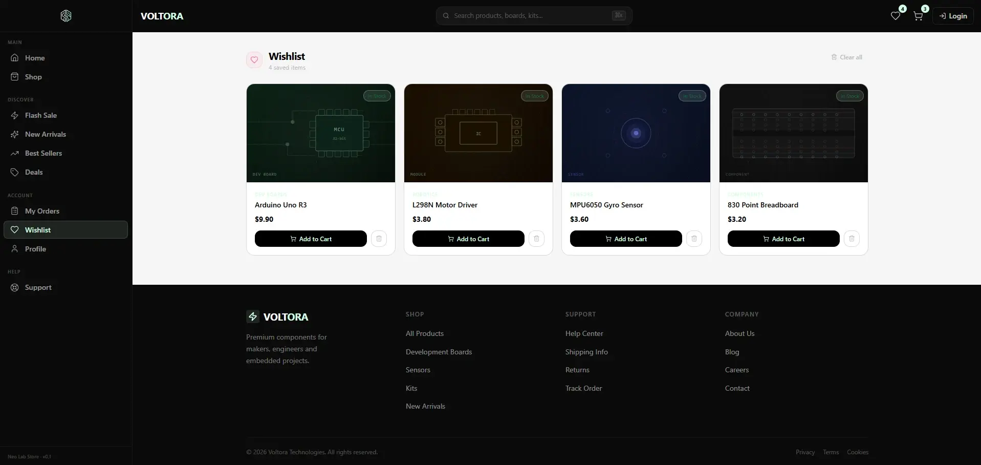
Connecting product selection to wishlist and a readable order summary.
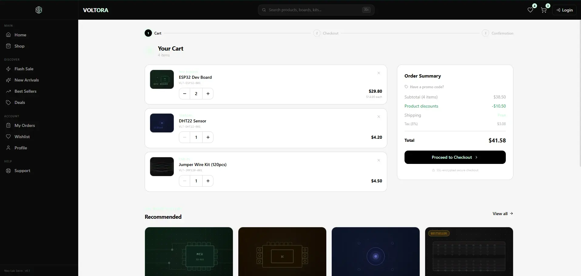
The wishlist screen lets someone gather products they are considering, separately from the cart. The cart interface then brings the selection together with SKUs, quantity controls, and an order summary that separates subtotal, discounts, shipping, and tax.
A three-stage indicator above the cart makes the rest of the flow — cart, checkout, confirmation — visible. All of it is frontend behaviour in the current version: no real order is created and no payment is taken.
- Wishlist with move-to-cart
- SKU and quantity controls
- Subtotal, discount, shipping and tax breakdown
- Promo code field
- Recommended products
- Three-stage flow indicator
Completing the account screens inside the same design system.
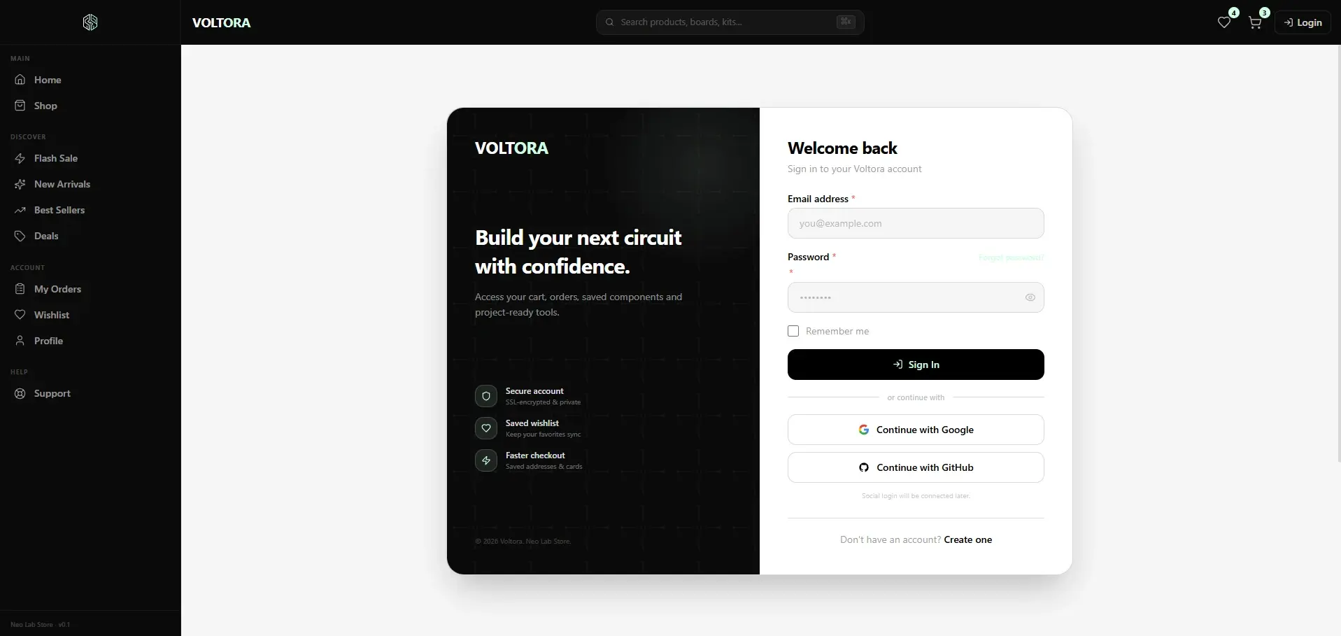
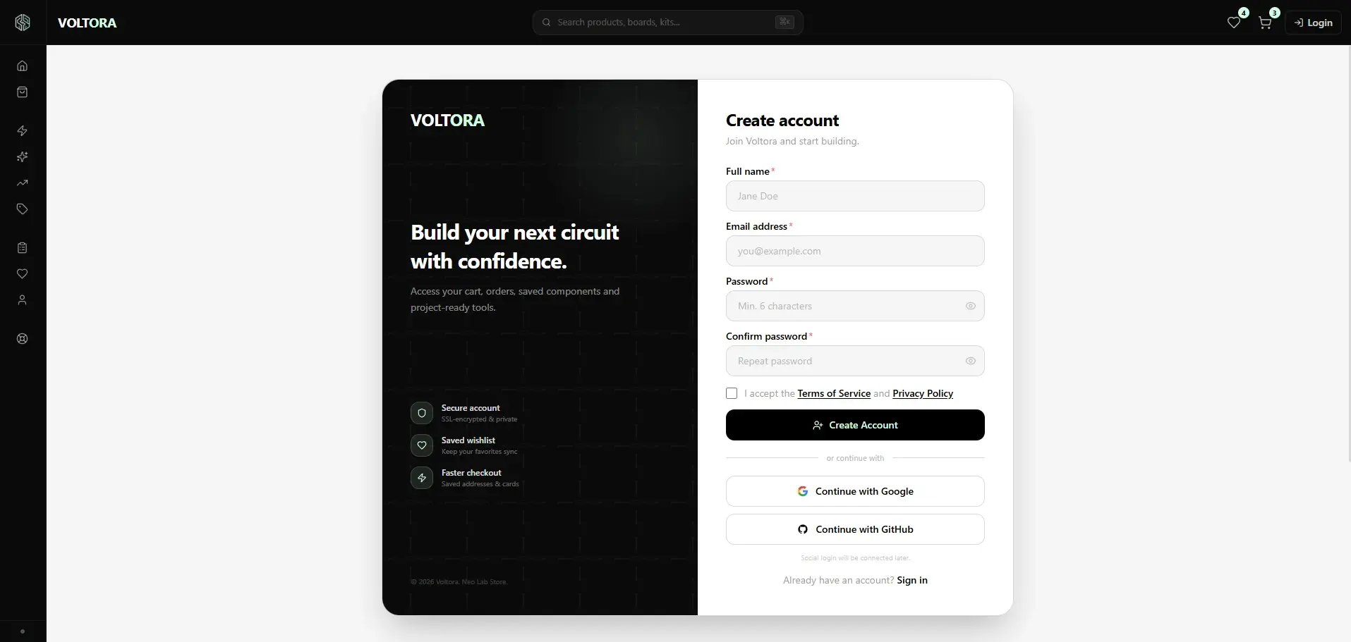
The sign-in and registration screens share one layout that places a dark narrative panel beside a light form panel. On the form side, required-field marks, password visibility, and password rules are all handled at the interface level.
The line under the social buttons — “Social login will be connected later.” — is the application’s own statement: those buttons do not currently reach a connected provider.
- Sign-in and registration flow
- Password visibility and rules
- Terms acceptance
- Social login awaiting connection
Interface
Technical Build
Product, cart, and user models are defined through TypeScript types; the current data comes from mock modules and hooks cover the related behaviour at the interface level.
- Interface
- React · TypeScript · Tailwind CSS
- Application
- React Router DOM · Framer Motion · Lucide React
- Tooling
- Vite
- Planned cloud layer
- Firebase Authentication · Cloud Firestore · Firebase Storage
Outcome
Voltora brings a broad e-commerce interface — storefront, product discovery, wishlist, cart, and account screens — under one shared component and design system.
The project is an interface-engineering exercise in how the product model, filtering, responsive layout, and the various shopping states can be built at the frontend level before a real backend is connected.
Current scope and next areas of development
- Product data comes from mock sources; the application states this itself through a preview notice.
- Cart, wishlist, and user flows are frontend behaviours.
- The Firebase connection is not active yet; it is planned as a later development phase.
- No real user account is created, and no real order or payment is processed.
- Social login providers are not connected yet.
- Ratings and review counts on the product cards are mock data, not real customer reviews.
- An administration panel is not part of the current scope.
Related insights
- Why a Beautiful Product Interface Can Still Be Hard to UseVisual quality doesn't guarantee usability. Information architecture, unclear actions, and cognitive load break it quietly.
- When Is the Right Time to Build a Design System?Not every product needs one. Built too early, a design system costs more than the problem it was meant to solve.
- Common Mobile UX Mistakes and How to Avoid ThemMobile design isn't a shrunken desktop layout. Content priority and touch behaviour have to be reconsidered.
Working on a similar digital product?
Share the need, the current situation, and your goals so we can evaluate the right starting point together.